Always Look Your Best
Mobile First. Progressive Enhacement. Responsive Web Design.
Today's web is dynamic. The desktop-centric designs that dominated the web only a few years ago are becoming obsolete. Tablets. Phones. E-Readers. Laptops. A myriad of different resolutions and screen sizes.
These are no longer simply websites. These are dynamic web experiences.
The Technology
This website is a hybrid of several technologies. We've taken the best from responsive web design and combined it with cutting edge techniques like progressive enchancement, media queries, and device detection. Some of our tools and influences are:
- Yeoman
- Nanoc
- Yiibu
- 320andUp
The Process
Our design process starts with mobile first. Only the essentials. By identifying what is truly important to your users, we eliminate waste. Pages load faster. Conversion rates go up. Customers are happpy.
Next
Adding eye-catching visuals is easy when you've identified what's important. Instead of trying to fit more and more into a smaller and smaller screen. We add more features only when the device and screen size allows.
Awesome
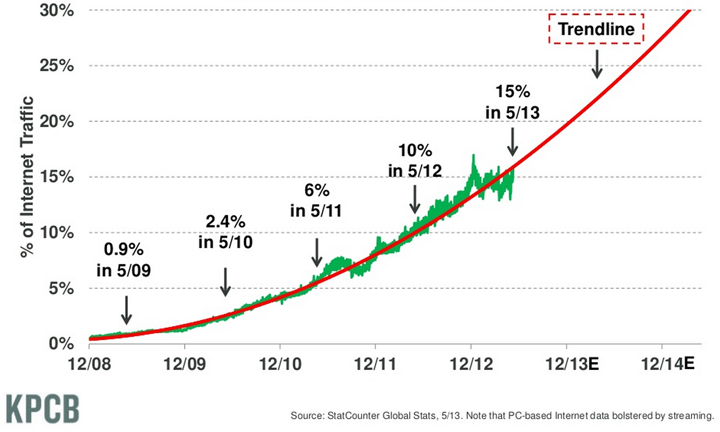
There's no point creating something that only looks good on a PC. Mobile Traffic has been growing at a pace of 150% per Year. This trendline will likely hold or even accelerate:
Global Mobile Traffic as % of Total Internet Traffic
Constantly Learning
Here at MFRW Design we truely recognize the importance on constant improvement. Always on the look out for new technology, we strive to stay on the cutting edge of the mobile-first responsive web. Have a tip you'd like to share with us? We'd always love your input.
Supported browsers and devices
At the moment we can confidently state that this site works beautifully on most modern smartphones, many legacy smartphones, and most tablets and desktop browsers.
Spreadsheet Log: a log of all supported browsers.